Tuesday, 30 November 2010

QUESTIONNAIRE - HELPING ME WITH IDEAS FOR MY MUSIC MGAZINE

To find out the basic knowledge of the 'indie' magazine that I have decided I am going to create, I decided to create a questionnaire. Asking specific questions based on the infomation that I wanted to know before planning my ideas. I gave this questionnaire to ten people who are into 'indie' styled music, this means i could get more of c chance of creating a better image for my magazine.

From the questionnaires completed I found out that:
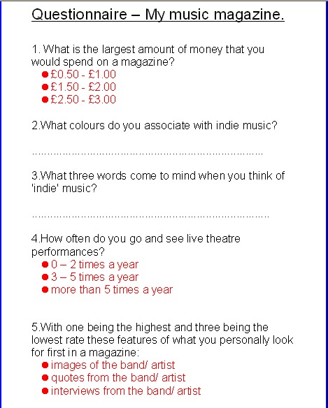
  • 40% of the people who filled the questionnaire said that they would pay '£1.50-£2.00' the other 60% said that they would pay '£2.50-£3.00' this feedback has shown me that people will be willing to pay between £1.50 and £3.00. This has given me an idea of where I should base my price. The original price of NME magazine in which i would like to base my price around is £2.20. This has enhanced my knowledge when it comes to pricing my magazine.
  • The feedback I got back from the questionnaires when I asked about what colours they associated with indie music were: black, white and red. This gives me an idea of what colours I can use on my magazine to appeal to my audience.
  • The words that people wrote down that they associated with indie music were: underground, retro, cool, glamour, guitars. These words appealed to me because they gave me an insight into what people associate with indie music.
  • 100% of the people that filled out my questionnaire circled '3-5 times a year' this shows that being 'indie kids' they are obviously into their music, so they go and see live music gigs.
  • Most people that filled out the questionnaire put number one as 'pictures and images' on the magazine that they look at first. This has motivated me to make sure that i have excellent photography id this is what my readers will look at first and I want them to have a good first impression. Most of them then put 'quotes from the band artist' next. Showing they they want to know the 'wise words' of their favourite band/artist. When i put quotes in my magazine I have to make sure that they are interesting and will attract my readers attention.

Monday, 29 November 2010

MASTHEAD IDEAS FOR MY MUSIC MAGAZINE

My magazine is going to be an 'indie' styled magazine so I feel like I have to have a 'cool' and 'authentic' name.
The names for the magazine I have thought of are:

- 'PLEC' magazine.
This is an abbreviation of the word 'plectrum' which is used for a guitar, I think this is fitting with the house style of the magazine because most bands would be associated with musical instruments.

- 'UNDERGROUND' magazine.
Underground is the essence of indie music. This is where all  indie bands, they spit in the face of main stream music.

- 'REBEL' magazine.
The word rebel gives out a naughty connotation, it gives an edge to all good indie bands/artists.

- 'BANNED' magazine.
This is a pun for the word 'band.' However i have spelt it as 'BANNED' to give off a cutting edge and a rebel feel to the indie music magazine.

I feel that all these names would be very appropriate to call an indie magazine. For advertising sake I feel that 'BANNED' magazine would be the best. However I have not yet made my decision.

MUSIC MAGAZINE INVESTIGATIONS

For double page spreads in magazines I have discovered that you can haven different types of double page spreads, containing different types on infomation and different ways of potraying this infomation.

- Artist Interviews
- Artist Features
- News features (music related)
- Artist Interviews
- Double page adverts
- Live music Reviews
- Q & A's
- Mail/ Letters (fans)
- Editorials/ Editors note.


In my magazine I would like an 'NME' feel to it. I want my magazine to be very 'easy' to the younger audiences eye. I want my magazine to be cool and 'indie' styled.

When I first thought about which one that I would like to do, I had to think very hard. I had to think about which would suit me, and which one that I think that i would be successful at. I have decided that I will either do 'artist interview' or the 'artist feature.'
I have not chosen to do a 'live theatre review' because personally I feel that when it comes to the photography of a live performance this would not be my strongest area. I think i would be more successful in taking studio photographs for my magazine.

Thursday, 25 November 2010

RE-MAKE AND RE-MODEL. NME MAGAZINE.


Before i made this front cover of NME magazine, i looked at copies of the NME magazine to check out what kind of house style they used and how they portrayed certain codes and conventions. They go for the 'cool' and 'edgey' look. So this is what i wanted to do with my main image. When I styled what my model was going to wear i thought carefully about whether is would fit in or not with the context of the magazine. The dress is pretty yet has an edge to it in contrast to the red lipstick, giving off a connotation of being a 'rebel.' I decided to have my model holding a pair of shoes in her hand, with a face of 'do i look bothered?' giving it an almost attitude look. I decided to have my model looking right towards the reader for direct address. Directing the readers attention straight away. I have put no other images on the front cover of this magazine because i noticed that NME magazine don't tend to do this, they just focus on one band or artist. Which is what i decided to do. The mast head i decided to put in the top left third as this is what NME magazine usually do, i decided for it not to cover part of my main image because i wanted all eyes on the main image. As the band 'Hannah and the hats' are very popular at the minute and its what everyone is talking about. I decided to have the main headline 'HANNAH AND THE HATS' to be put straight across the main image (not over any important facial features, but over the skin area) to show the reader what this magazine is focusing on. I have also used a pug at the top of the page, enticing the reader in with what the magazine has to offer, the word 'free' will automatically entice the reader into buying the magazine. In the coloured band and the bottom, i have chosen red as the background in the text box: to fit in with the main colour of red on the front cover.) I have used a list of three 'PARTY PARTY PARTY' in this coloured band to exaggerate to the reader of how much gossip and infomation is inside, i have also used elipsise '...' to leave the reader in suspense and making them open the magazine and buy it to find out more. I also noticed that on the front covers of NME magazines they usually have lists of bands/artists of who they have gossip and interviews with to make the magazine seem like its worth buying with lots of infomation. So i have decided to do this, listing popular bands and artists which will fit for this type of 'indie' magazine.


However, now looking at the magazine I feel like if I created it again I would make a few changes to it. Firstly I would take away the PUG at the top of 'FREE POSTER' because I feel this doesn't fit in with the rest of the magazine. I feel that it ruins the overall 'look' of the magazine. If I re-did this magazine I would also take away the full stop from 'HANNAH AND THE HATS' because magazines do not tend to do this, they do not use correct grammer, and they use very colloquial language. To fit in with the 'NME' style magazine I would have to make these two changes, then the front cover would be excellent.


Thursday, 18 November 2010

ANALYSING DOUBLE PAGE SPREAD - 'Q' MAGAZINE

This double page spread from the well known 'Q' magazine is extremeley eye catching. With the black dark background, the red and white writing really does stand out. The main picture is of 'Madonna' in whom this article is written about, infact this is actually an interview with the superstar herself. This image would appeal to the male audience? This is because Madonna looks very attractive, it would also appeal to the female audience because most women would love to read an interview where they can get all the inside gossip of her life and what she will be doing next. 'Madonna' is written in nig white writing, contrasting to the black background, showing the reader who this is about. Above this is the words 'special edition' this would automatically grab the readers attention and they would want to read it. This makes this magazine 'original and authentic' if they have a special edition with a international popstar. They use this to its advantage by also having Madonna on the front cover.

ANALYSING CONTENTS PAGE - 'Q' MAGAZINE

This is a contents page from 'Q' magazine, a well known music magazine. To show that this is the contents page is has 'contents' as the title with the logo 'Q' next too it. This contents page has one main picture of a well known band. It also has a subheading of 'features' with a long list of what the magazine has too offer. This conveys that this magazine is full on infomation, which would be good for the reader to know. 'Oasis special!' is also put in a box underneath this list, the word special gives the reader the connotation that this magazine may be the onlt magazine that has this infomation making the reader feel special and interested to read it. There is also a heading showing that there are 'reviews' in the magazine, so if the reader is thinking of buying a single or an album then they know from the contents page that they will be able to look it up in the magazine. The date is also shown on the contents page to show that the articles etc are all up to date and new. I think that this is a very simple layout, however it uses lot of devices to make the reader wnat to read the magazine, this contents page sells to the reader whats in the rest of the magazine.

ANALYSING FRONT COVER - 'Q' MAGAZINE


This front cover is from 'Q' magazine which hols all the latest infomation and gossip about all the celebrities and their music. This magazine would be targeted towards a 'mass market' audience. The name of the magazine is 'Q' this is shown clearly at the top of the page. The main image is of 'Madonna' an international superstar, the editor has used her on the front of the magazine to obviously show off the gossip that they have about this international wonder. Which would appeal too any reader. Madonna is also shown in big capital letters, also in red in contrast to the rest of the page, to make it stand out. Underneath this is a quote 'stupid question! next!' this would automatically appeal to any womens eye, women love a bit of drama therefore i think that the editor chose to put this on here to draw in the buyers and make that wider range for potential buyers. The pugs and puffs used also draw the reader in '196 page bumper issue!' 'the best british albums are voted by you' make the reader think that they are getting more than they paid for. Showing that the magazine has a lot to offer. Syndetic listing is also used, revealing all the names of bands and artists, yet again showing that the magazine has a lot to offer. The band across the bottom says 'FREE INSIDE' and as a buyer you automatically look at what is free inside the magazine if you purchase it and this is 'women in music' 70 page special. This would appeal to the female audience as this would be the kind of articles that the women would like too read. The bar code and the date is also on the magazine showing that it is recent with all the new hot gossip.

ANALYSING CONTENTS PAGE - NME


This is  contents page for the magazine 'NME' a well known magazine aimed towards a 'mass market' audience. The title states that this page in the magazine is the contents page, it also has the date to show that this magazine is recent. This type of magazine will be read by people who like 'indie/soft rock' music. The pictures on this magazine show the reader what the magazine has to offer, the pictures are big enough to see portraying the different bands that the reader may be interested in. This contents page uses the main colour of orange, this makes the article look brighter. The main headline of  'drummer' is big and bold - stating what main articles are going to be in the magazine.

ANALYSING DOUBLE PAGE SPREAD - KERRANG!


This double page spread, from a well known 'KERRANG!' magazine would be targeted towards the 'mass market' audience. This magazine article is about front man Dave Grohl in the Foo Fighters. From the pictures that are mainly towards the left hand side of the double page spread, you can tell that these pictures are of certain events in his life. Any Dave Grohl fan would be instantly drawn in by these pictures (one of him with the kerrang award, another with a friend, another of him playing live on stage.) These pictures obviously would support the articles text. The text is presented in colunms, this will make it easier to read, plain font is used for this same reason. 'You've got one life so you better live it whilst you can' is the quote that is used at the top of the page maybe illustrating to the reader that Dave Grohl (who this article  is about) is living his life the best he can! This makes the reader want to read this article to find out what he is getting up too. Extra infomation is also added in little notebook pictures, using the colour orange and black, contrasting to the white background, making it stand out.

Wednesday, 17 November 2010

ANALYSING CONTENTS PAGE - KERRANG!


This front cover is from the 'mass market' magazine; KERRANG! From a first glance of this magazine, it looks very busy, it looks like it has a lot too offer, which would excite the reader into knowing that there is a lot of articles, things too find out inside. There are a lot of pictures on this contents page, showing a lot of famous singers,and there CD covers. Advertising the CD's to the reader. The contents page also advertises other kerrang magazines. On this specific magazine it also has an 'editors note' maybe saying what inspired him to do the magazine, thanking everyone who made it possoble. The subheadings are shown clearly with yellow writing contrasting on a dark background showing the reader where to look, and making it easy too find what they want. The main heading saying 'contents' is also very easy too spot making the reader looking at it so they can find out whats in the mgazine.

ANALYSING FRONT COVER - NME


This magazine cover for a world wide known magazine 'NME' appeals to a 'mass market' audience. The main image and only image on this front cover is of Lily Allen, with her being a well known singer in the music industry this would be vital to catching attention to the browsers eye. The masthead 'NME' is in the top third of the magazine, its a well known logo so it has to be shown. The main headline 'Lily Allen takes on the world' is very exaggerated, to make a point to the reader, making them want to take a look inside. This main headline is white writing with a black backing, really makes it stand out from the rest od the cover. This is supported by a quote 'i cant keep on living like this, its doing my head in' The use of modern day speaking terms 'doing my head in' will appeal to a modern day, maybe younger audience. The editor of the magazine would have chosen to put this quote on there for that specific reason. The use of pugs and puffs shows the reader what this magazine has to offer, what information about certain bands etc. All the pugs and puffs all have a coloured background, making it stand out from the white background of the magazine. At the bottom of this magazine a band of red is illustrated with plenty of band names; asyndetic listing, which portrays how much infomation this magazine does contain about certain bands/artists. With the word 'PLUS' infront of it, illustrating that as well as what you can already see on the front cover, the mgazine also has infomation on all these bands. Overall this magazine is a eye catching authentic magazine which will appeal to the eye.

ANALYSING DOUBLE PAGE SPREAD - NME


This double page spread is for the well known magazine 'NME' this would be for a 'mass market' audience.
This magazine spread uses three main colours, black, white and red. For all the readers that know of Lily Allen will know what type of charecter she is; very loud, bold and 'in your face.' The main image on this double page spread is of Lily Allen (who this article is about.) This image is near the right hand side of the article, leaving the rest of the page to hold the text. Her body language and facial expression shows that she has something too say, this is supported by the headline 'people think im an attention seeker, but im just honest' this headline is obviously a quote from what Lily herself has said. This headline is shown to be made out of letters from newspapers, giving the article an 'edge.' This headline would also appeal to the female audience because women do love gossip and the word 'attention seeker' can give out a lot of negative connotations, which women do love! The subheading is bold compared to the actual article itself, having 'Lily Allen' in red compared too the rest of the sub-heading which is in black shows the reader what this article is about. The article is set out in colunms, making it easy to read but still holding all the infomation it needs.

Wednesday, 10 November 2010

ANALYSING FRONT COVER - KERRANG!

This magazine cover would be aimed at a 'mass market' audience. A lot of people would be interested in this magazine. However, some people may argue that its for a 'niche' audience. This would be because not everyone will like 'rock' music. This front cover is extremely effective. The masthead at the top of the cover shows the reader exactly what the magazine will mainly be about 'ROCK.' The dark colours of the magazine (representing possibly death, hardcore music) contrasts with the pink main head line 'GUNS N' ROSES' informing the reader what the magazine is mainly about. The main picture gives off a connotation of being 'cool.' Enticing the audience to read the magazine. The puff 'free CD' convinces the audience to buy the magazine, it illustrates to the reader that you get more than you bargained for in the magazine! The way its in a bright yellow box makes it stand out from the rest of the magazine, making the reader take notice. The barcode and date and price of the magazine is on the cover, showing the reader that its up to date with all the latest news and gossip from the 'rock world' also showing the price, this is very important. People would not want to pay a dear price. The main rock bands 'thin lizzy' 'the clash' 'def lepard' are in bold, and is also in capital letters. Showing the person interested again, what the magazine has to offer. As this magazine is based around 'rock' you would not have big pink writing, pictures of different genres of music. It just wouldnt fit in. This magazine totally fits in with the stereotypical 'rock' genre.

Wednesday, 3 November 2010

CODES AND CONVENTIONS - MAGAZINE COVER THREE

To put together this magazine cover i used microsoft word and paint.
This is the front of a magazine about the programme that everyone seems to be talking about- Big Brother.
However, i have purposley given nothing away on the front cover to not reveal what will be in the rest of the magazine. The pictures are relevant to the subject and title of the cover, so this again catches the readers attention. Having an attractive presenter i can use this to its advantage, drawing in male buyers.
I think that this magazine cover is eye catching, yet doesn't give away much information on the front cover, leaving a feeling of wonder.

CODES AND CONVENTIONS - MAGAZINE COVER TWO


This magazine cover was produced using microsoft word and paint. 'Photography Now' would be for a niche audience aiming towards photographers hence the title of the magazine.
The masthead is at the top, showing the title of the magazine and what its selling. I have chosen this magazine to be simple, only showing one photograph of whats inside the magazine. I have included the 'free poster' pug because all magazines do it to sell, this convinces the audience to buy the magazine. I have chosen to use a black and white picture and black font (except the 'free poster' at the bottom) to show the sophistication of the magazine.

CODES AND CONVENTIONS - MAGAZINE COVER ONE


I made this magazine using Microsoft Word and Paint.
This music magazine cover has a main image, to show the real reason why the person would by the magazine. In this case it would be because they liked eminem. This magazine is aimed towards a 'male' reader who maybe enjoys 'rap' music. I have used rhetorical questions, to show that the answers will be inside the magazine if purchased. I have also inluded other celebrities on there for people who may have a liking to one of them. The logo of the magazine is also on their, showing what type of magazine it is. The magazine is aimed towards a 'Mass Market' meaning that anyone who likes this type of music, these artists can read the magazine. The 'guess whos back' is a lyric from one of Eminems well known songs.

Tuesday, 2 November 2010

MOCK MAGAZINE - FRONT COVER


This is my mock 'front cover' for the school magazine for my preliminary magazine. I used Microsoft Word and Paint too contruct this front cover for my school magazine. I have used puffs and pugs to grab the audiences attention into buying the magazine. My main picture is essential here as it will be the first thing the reader will see, therefore i have chosen this picture because its diectly looking at the reader. enticing them in. I have also used bright colours and legible writing, the bright colours again entice the audience, as the front cover of a magazine should. The main headlines are in bigger font to the extra information, to show whats on offer in the magazine to the sixth form students. I have also used a list of three 'new teachers, new activities, new start to the year' to convey the feeling thats its the beginning of the year and already a lot is going on. The headliners provide the reader with an insight into the magazine about everything thats new in the school, making the readers of the magazine enticed. I also think that the front cover also is appropriate for a modern day audience. Which is the 'sixth formers' of the school.

If i was in sixth from, i would buy this magazine because it contains all the infomation that i would want too know as a student. The infomation is also fun and interesting, its also portrayed well through the font used and the colours.