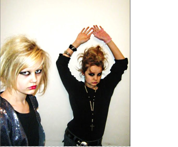
Here is my final front cover for my magazine 'UNDERGROUND.' I edited my picture to get rid of the white background properly so i could put it over my masthead. I chose this picture because i think that it gives the attitude that this type of indie magazine needs. The edited real life look, makes the picture look like it has been taken in a studio. This picture portrays the teenagers as 'rock chicks' giving it a lot of attitude. I did this because all music magazines seem to do it because theie magazines are well heard of. I also decided to make the masthead bigger to portray the name of my magazine and to 'sell it big' within the music magazine competition, showing the name of my magazine.
I have put all the main headlines down the right hand side, showing originality to my magazine because normally magazine headlines are on the rihght hand side. I have stuck to the main colours of red, white and black, throughout the front cover. This is because if i had a range of colours it could have made my magazine look a bit too much. So i decided to stick to what NME do, which is staying with three or four basic colours - which are used throughout the magazine. I decided to have the main headlines in red and then the 'info' underneath in smaller writing in black. I did this so the red headlines will stand out more and then the reader can read below at the bit of extra infomation or a snippet of what its about. Where the band name is i decided to put a white box behind it to make it stand out from the rest of the front cover. I then decided to put a list of three below this 'rock, glamour, boys.' I have also put a banner across the bottom 'free posters' drawing the reader in to buy the magazine. The barcode is on the side of the magazine, which is essential for any magazine.

This is my final contents page for UNDERGROUND magazine. As you can see, i have kept the main colours of red, white and black: matching to my front cover and will be matching to my double page spread. The title of the contents 'WHATS UP?' shows that i have thought about what type of magazine i am going for: and the title whats up portrays this, giving it a sense of attitude. I have also put the date and month of the monthly issue underneath in much smaller writing. The three pictures i have used are inside a polaroid picture frame, making the pictures original and making them stand out. Because this magazine is all about music i have decided to put a band index on the contents page showing the infomation about each band on what page. This long list would draw in the reader showing the reader that this magazine has a lot to offer. The middle column shows what mainly the magazine has: and in this case its Album reviews, Live reviews, Features and prizes that you can win. With 'WIN WIN WIN' being a triple. I have also put the editors note along the bottom because i think that this is important.